
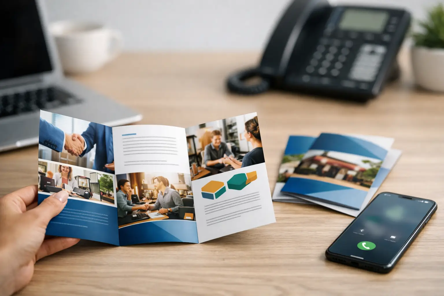
A brochure is often picked up when you are not there to explain your business. It may sit on a reception counter, go home in a customer’s bag, or be handed out after a conversation that lasted two minutes. That is why small business brochure design needs to do more than look polished. It needs to explain what you do, build confidence quickly, and give people a clear reason to take the next step.
For a local service provider, startup, or established small company, a brochure can still be a practical sales tool. The key is treating it as part of your customer journey, not as a piece of paper filled with everything you want to say.
What Effective Small Business Brochure Design Must Do
A strong brochure answers the questions a potential customer is already asking: What does this business offer? Is it right for my situation? Can I trust them? What should I do next?
If the design does not make those answers easy to find, even an attractive brochure will underperform. Small business owners are often tempted to include every service, every feature, every credential, and every special offer. The result is usually crowded, hard to scan, and easy to put down.
A better approach is to decide on one main job for the brochure. It might introduce your company, promote a specific service, support sales meetings, explain a seasonal offer, or encourage appointments. A general company brochure can cover your core services, but it should still lead readers toward one action, such as calling for an estimate or scheduling a consultation.
Start With the Customer, Not the Company History
Your business story matters, but it is rarely the best opening message. Customers first want to know whether you can solve their problem.
Instead of leading with, “We have been serving the area since 2012,” begin with the outcome you provide. A roofing company might lead with dependable repair and replacement services for homeowners. A bookkeeper might focus on helping business owners gain clearer financial records and more time to run their companies.
Your experience, certifications, and local history should support that promise. They build credibility after the reader understands the value. This order matters because a brochure has limited space and limited attention.
A useful message framework is simple: identify the customer need, state your solution, show why your business is credible, and explain how to get started. That framework keeps the brochure focused without making it sound generic.
Choose the Right Brochure Format for the Job
The format affects both cost and usability. A standard tri-fold is familiar, compact, and cost-effective for many businesses. It works well when you need a clear overview of your services, contact information, and a straightforward call to action.
A bi-fold brochure gives you more room for larger images and fewer message breaks. It can be a better option for businesses with a more visual offering, such as home remodeling, event services, real estate, or product-based companies.
Multi-page booklets make sense when customers need more detail before buying. Examples include medical practices, financial services, complex contractors, schools, and professional firms. However, more pages are not automatically better. If your audience needs a fast introduction, a booklet may create unnecessary printing costs and make the message feel heavier than it needs to be.
Think about where the piece will be used. A brochure displayed in a lobby needs a strong front cover that earns attention from a distance. One given to prospects after an in-person consultation can include more specifics because the conversation has already created context.
Make the Cover Earn the Open
The front cover has one job: make the right person want to open it. Your logo is important, but a logo by itself does not communicate enough.
Use a short headline that speaks to a real customer need or benefit. Pair it with an image that feels relevant to your business and your market. If you use photography, choose images that show your team, finished work, products, or customers in a believable setting. Stock photos can be useful when chosen carefully, but overly staged images can make a local business feel less personal.
Keep the cover clean. A crowded cover with several logos, service lists, badges, and phone numbers creates visual competition before the brochure even begins. Give the main message room to stand out.
Build a Clear Reading Path Inside
Most people will scan a brochure before they read it. Design should guide that scan with clear headings, short sections, visual hierarchy, and enough white space to let important information breathe.
Put your most valuable message near the beginning. Avoid burying your primary service or strongest differentiator in the middle panel. Use headings that make sense even if a person only reads the larger text. “Residential and Commercial Cleaning” is clearer than “Our Solutions.” “Schedule Your Free Estimate” is clearer than “Contact Us.”
Paragraphs should be brief and specific. Replace broad claims such as “quality service you can trust” with proof. Mention licensed professionals, response times, years of local experience, warranty coverage, process details, customer results, or specialized equipment when those points are true and meaningful.
Color and typography should match the rest of your brand. A brochure that looks completely different from your website, business cards, vehicle graphics, or social media creates a disconnected impression. Consistency helps people recognize your business and makes a smaller company look more established.
Include Services Without Creating a Wall of Text
Service lists are useful, especially for companies with several offerings. The challenge is making them easy to understand.
Group related services into logical categories rather than presenting one long list. A landscaping company, for example, could separate lawn maintenance, seasonal cleanup, landscape installation, and commercial services. A marketing firm could separate brand design, print materials, digital marketing, and business growth support.
Keep descriptions focused on what each service helps the customer accomplish. Technical details have a place when they influence a buying decision, but they should not overwhelm the core message. If customers regularly ask the same question before contacting you, that detail may deserve space in the brochure. If it only matters after they become a client, save it for the consultation or proposal.
Use Calls to Action That Are Easy to Follow
A brochure should never leave a reader wondering what happens next. Make the call to action visible, direct, and appropriate for your sales process.
For some businesses, the best next step is a phone call. For others, it may be a quote request, an in-store visit, a consultation, or an appointment. Include the key contact details in more than one place when the layout allows it, especially on the back panel where readers expect to find them.
A QR code can be helpful if it leads to a useful destination, such as an appointment page, service request form, portfolio, or offer. It should not replace your phone number or website. Some customers will scan it, while others will prefer to call or type in your web address.
Be careful with offers. A discount can motivate action, but it is not the only reason people choose a small business. For service companies, a clear promise, timely response, and professional presentation may be more valuable than a coupon that reduces your margin.
Prepare Files Correctly Before Printing
Even a good design can look unprofessional if the production details are missed. Images should be high resolution for print, colors should be set up for print production, and important text should stay safely inside trim margins. If the design uses color or photos that extend to the edge, the file needs bleed so the finished brochure does not show unwanted white borders.
Paper choice also affects perception. A heavier stock can make a brochure feel more substantial, while a glossy finish can help photography and product images stand out. Matte stock often feels more understated and is easier to write on. There is no single right choice. It depends on your industry, budget, and the impression you want to create.
Before approving a full print run, review a proof carefully. Check phone numbers, email addresses, service areas, pricing language, spelling, and panel order. Have someone unfamiliar with the project look at it too. They are more likely to spot information that is unclear because they do not already know your business.
Treat the Brochure as a Working Sales Tool
A brochure should be distributed with purpose. Keep it at your front desk, include it in customer packets, leave it with referral partners, use it at networking events, and give it to sales prospects after meetings. Train staff on the key message so the brochure supports the same conversation your team is having in person.
You can also learn from how people respond. If prospects repeatedly ask about a service that is already listed, the wording may need to be clearer. If they mention one section often, that may be your strongest selling point. Small updates between print runs can make future versions more effective.
Your brochure does not need to say everything about your business. It needs to say the right things clearly enough that the right customer feels confident contacting you. When the message, design, and next step work together, a simple handout can keep creating opportunities long after it leaves your hands.