
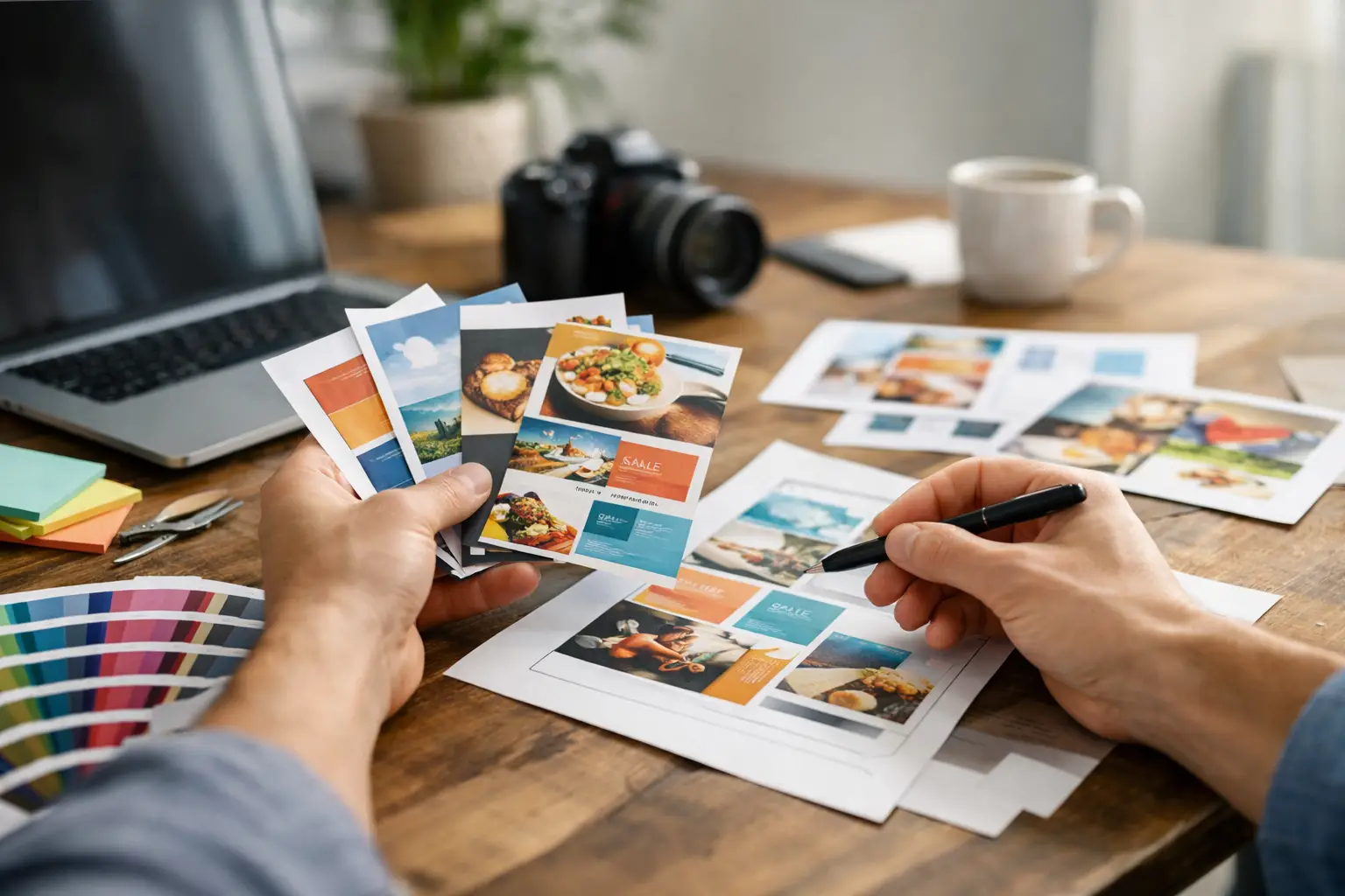
A flyer has about three seconds to earn attention. That is the reality when someone is sorting mail, walking past a bulletin board, or scrolling through a neighborhood feed where your printed piece also appears as a digital image. If you are learning how to design marketing flyers, the goal is not to make something that simply looks nice. The goal is to make something clear, believable, and easy to act on.
For small businesses, flyers still matter because they are affordable, local, and flexible. A well-designed flyer can promote a seasonal offer, introduce a new service, support an event, or keep your brand visible in the exact neighborhoods where your customers live and work. But cheap printing and easy templates have also created a problem: too many flyers are crowded, generic, and forgettable.
How to design marketing flyers with a business goal first
Before you choose colors, photos, or fonts, decide what the flyer needs to do. This sounds basic, but it is where most weak flyer designs go off track. If the objective is fuzzy, the design becomes cluttered because every message starts competing for space.
A flyer should usually do one primary job. That might be generating calls for a service business, driving foot traffic to a grand opening, promoting a limited-time offer, or building awareness for a new business in a local market. When you try to make one flyer accomplish all four, the result is usually too much copy, too many visuals, and no clear next step.
Start by asking three practical questions: Who is this for? What do they need to know right away? What action should they take after reading it? Those answers should shape every design decision that follows.
For example, a landscaping company advertising spring cleanup does not need a flyer that explains every service it has ever offered. It needs a strong headline, a clean visual, a few trust-building points, and a simple call to schedule an estimate. That kind of focus is what makes a flyer perform.
Keep the message simple enough to scan
Most people do not read flyers word for word. They scan. That means your design has to guide the eye quickly from the main message to the supporting details and then to the call to action.
The headline matters most. It should say something useful, not something vague. "Professional Solutions for All Your Needs" is too broad to mean anything. "20% Off Lawn Care for New Customers" gives the reader an immediate reason to keep looking. Specificity almost always beats cleverness in flyer design, especially for local businesses that need fast response.
Once the headline does its job, the supporting copy should stay tight. Focus on the information that helps a customer decide. That may include your service area, a short list of benefits, a promotional deadline, or one or two credibility signals such as years in business or licensed and insured status. If every sentence feels equally important, the flyer will feel hard to read.
White space helps here. Small business owners sometimes worry that open space looks unfinished, but the opposite is usually true. A flyer with breathing room feels more professional and easier to understand. A packed flyer looks stressful before anyone reads a single word.
Design for hierarchy, not decoration
Good flyer design is less about adding elements and more about organizing them. Visual hierarchy is what tells the reader where to look first, second, and third.
Your headline should be the most prominent element. The offer or value proposition should come next. Contact details and the call to action should be easy to find without overpowering the main message. Images, icons, and accent colors should support that flow rather than interrupt it.
This is where many template-based flyers fall apart. They often include multiple shapes, competing fonts, oversized graphics, and too many highlighted sections. The design may look busy and "creative," but it does not help the customer understand the message faster.
A cleaner layout is usually the better business decision. Use one or two fonts at most. Keep alignment consistent. Choose a color palette that matches your brand instead of trying to use every accent color available. If your business already has a logo, website style, or social graphics, your flyer should feel connected to them. Consistency builds recognition, and recognition builds trust.
Use images that support the offer
Photos can strengthen a flyer, but only when they are relevant and professional enough to support your brand. A blurry stock image or a generic smiling group photo rarely helps a local service business stand out.
If you have quality photos of your work, use them. A home cleaning company showing a spotless kitchen, a contractor showing a finished remodel, or a bakery showing signature products will usually outperform generic imagery because it feels real. Customers want evidence, not filler.
That said, not every flyer needs a large photo. In some cases, bold typography and a simple layout are stronger, especially if the message is time-sensitive or offer-driven. The right choice depends on the type of business and what builds confidence fastest. If the image adds clarity, keep it. If it just takes up space, remove it.
Make the call to action obvious
If a flyer gets attention but does not prompt action, it has not done its job. Your call to action should tell the reader exactly what to do next and make that step easy.
"Call today for a free estimate," "Book your appointment by Friday," or "Bring this flyer in for 15% off" are all stronger than a passive line like "Contact us for more information." Clear language creates momentum.
Placement matters too. Do not bury your phone number, email, or location in a crowded footer. If the desired action is to call, that number should be easy to spot. If the goal is in-store traffic, your address and offer should work together. If you include a QR code, make sure it supports the main action rather than adding one more choice to an already busy layout.
There is also a trade-off here. Giving people multiple ways to respond can be helpful, but too many options can weaken response. For some campaigns, one strong action is better than three moderate ones.
Print choices affect results more than most businesses expect
Learning how to design marketing flyers also means thinking beyond the screen. A flyer that looks good on your monitor may not print the way you expect.
Paper size, finish, and print quality all shape how your brand is perceived. A glossy flyer might work well for a restaurant promotion or retail piece with strong photography. A matte finish may feel more polished for a consultant, wellness brand, or home service business. Heavier paper can make a stronger impression, but it is not always necessary for bulk distribution.
Color can shift in print as well. Bright digital colors may appear duller on paper, and small text placed over colored backgrounds can become harder to read. That is why testing matters. Print a sample before ordering in volume. What feels like a small detail on screen can become a costly mistake in production.
Distribution should influence design too. A flyer handed out at an event can include a bit more detail than one posted on a community board or mailed as a quick attention piece. Context matters. The more limited the reader's attention, the simpler the flyer should be.
Common flyer mistakes to avoid
The biggest flyer mistakes are usually not artistic. They are strategic. Businesses often lead with their company name instead of the customer benefit, overload the page with text, or use design elements that do not match the audience.
Another common issue is inconsistency. If your flyer looks completely different from your website, signage, or social presence, customers may not connect the pieces. That disconnect can make even a legitimate business feel less established.
There is also the problem of trying to save time by using a template with minimal changes. Templates can be useful starting points, but they still need real editing. A flyer should reflect your brand, your market, and your offer. Otherwise, it risks blending in with every other piece of local advertising.
For many small businesses, this is the point where outside support becomes practical. A partner like AKR Marketing Designs can help turn a rough idea into a flyer that is not just attractive, but purposeful and ready to support real business growth.
A good flyer should make the next step feel easy
The best flyer designs are rarely the flashiest. They are the ones that help a potential customer understand the offer quickly, trust the business behind it, and know exactly what to do next. If your flyer is clear, focused, and built around a real business objective, it has a much better chance of doing what marketing should do - create action, not just attention.
When you sit down to create your next flyer, do not ask whether it looks busy enough to seem valuable. Ask whether it makes the decision easier for the customer. That is where strong design starts, and it is usually where better results follow.