
A customer sees your truck wrap, visits your website later that day, then checks your social media before calling. If each touchpoint looks like it came from a different business, trust drops fast. That is why brand design and visual identity matter so much for small businesses. They shape how professional, organized, and credible your company feels before anyone experiences your service.
For many owners, branding gets reduced to a logo. That is understandable because the logo is the most visible piece. But customers do not experience your business through one file. They experience it through your website, business cards, estimates, social posts, packaging, signage, uniforms, presentations, and ads. When those elements work together, your business looks established. When they do not, even a strong company can appear inconsistent.
What brand design and visual identity really mean
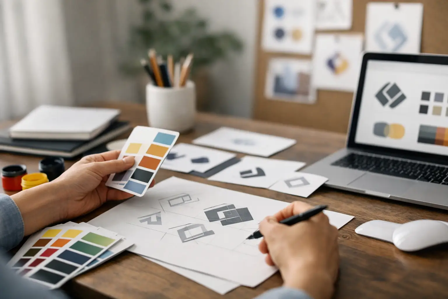
Brand design is the visual system that helps your business communicate clearly and consistently. Visual identity is the recognizable look of that system - your logo, colors, typography, imagery style, layout choices, and other design elements that shape how people remember you.
The distinction matters because visual identity is not just decoration. It supports business goals. A cleaning company may need to look dependable and polished. A fitness brand may need to feel energetic and motivating. A law office may need to project clarity and confidence. Good design choices signal those qualities quickly, often before a prospect reads a single line of copy.
This is where many small businesses get stuck. They know they need to look better, but they are not sure what better actually means. Better does not always mean louder, trendier, or more expensive. Better usually means clearer, more consistent, and more aligned with the customers you want to attract.
Why small businesses feel the impact faster
Large brands can survive a certain amount of inconsistency because they already have market recognition. Small businesses usually do not have that cushion. First impressions carry more weight when you are still earning visibility in your local market or niche.
If your Facebook graphics look casual, your website looks outdated, and your print materials use different fonts and colors every time, customers notice - even if they cannot explain what feels off. The result is often hesitation. People may wonder whether your business is established, whether you pay attention to details, or whether the experience will be as inconsistent as the presentation.
On the other hand, a strong visual identity helps level the playing field. It can make a smaller business look focused, credible, and ready to serve. That does not replace good service or strong operations, but it makes it easier for customers to trust you enough to take the next step.
The business value behind brand design and visual identity
Good design is often treated like a nice extra. For a small business, it is more practical than that. It affects recognition, trust, and efficiency.
Recognition comes from repetition. When your audience sees the same colors, typography, logo usage, and overall style across your materials, they start to remember you. That matters when customers are comparing multiple providers in the same market.
Trust comes from consistency. Professional design suggests that your business is organized and intentional. It tells customers you care about presentation and details. That message is especially important in industries where buyers are cautious, such as home services, healthcare, finance, consulting, and legal support.
Efficiency is the benefit owners often overlook. When you have a defined visual identity, creating new materials gets easier. You are not starting from scratch every time you need a flyer, social post, brochure, or digital ad. Your design decisions are already made. That saves time, reduces guesswork, and keeps your marketing from drifting in five directions at once.
What a strong visual identity includes
A useful visual identity is not bloated. Small businesses do not need a 100-page brand manual to get results. But they do need the core pieces to be intentional.
Your logo should be clear, readable, and flexible enough to work across print and digital applications. Your color palette should support recognition and reflect the personality of the business without making execution harder. Typography should be consistent and easy to use across platforms. Imagery should follow a style that fits your audience, whether that means clean service photography, product shots, or polished team visuals.
Layout style matters too. Spacing, hierarchy, button styles, graphic elements, and how information is organized all contribute to whether your brand feels polished or pieced together. A business can have a decent logo and still look inconsistent if every other design choice changes from platform to platform.
Where businesses go wrong
The most common problem is mixing styles over time. A business starts with one logo, then someone creates a social graphic in a different color palette, then a printer uses another font on a postcard, then the website gets updated without reference to any original design system. Nothing is completely wrong on its own, but together it creates a fragmented brand presence.
Another issue is designing for personal taste instead of customer perception. An owner may like a certain color, font, or graphic style, but if it does not fit the market or support credibility, it can work against the business. Branding should reflect the company, but it also needs to connect with the people buying from it.
Then there is the trend problem. Trend-based design can feel fresh, but it can also date quickly. Small businesses usually benefit more from strong fundamentals than from chasing what looks current for six months. A practical visual identity should still feel usable two years from now.
How to know if your brand needs attention
If your materials do not look related, your brand likely needs refinement. If your business has grown but your visuals still look homemade, that is another clear sign. The same goes for companies that have expanded services, shifted audience focus, or updated their pricing but never updated their presentation.
You may also notice internal friction. Maybe every time you need a promo piece, you spend too much time deciding colors, fonts, and layout. Maybe different team members create customer-facing materials that all look different. Those are not just design issues. They are workflow issues that affect your marketing speed and consistency.
A strong visual identity reduces that friction. It gives your business a repeatable framework, which is exactly what busy owners need.
Building brand design and visual identity with purpose
The best process starts with business clarity, not software. Before design work begins, it helps to define who you serve, how you want to be perceived, and what makes your business different in practical terms. A family-focused dental office and a high-end cosmetic dental practice may offer related services, but they should not look the same.
From there, design choices become easier to evaluate. Does this logo style match the level of professionalism you want to project? Do these colors support trust and recognition? Does this website layout make your information easier to understand? Those are more useful questions than simply asking whether something looks nice.
This is where working with a practical partner matters. Small businesses usually do not need branding wrapped in layers of jargon. They need design decisions tied to real business use. At AKR Marketing Designs, that kind of thinking matters because small business owners need branding that works in the field, online, and in day-to-day customer interactions.
Consistency matters more than complexity
A simple, well-applied identity will outperform a complicated one that is hard to maintain. That is especially true for smaller teams. If your branding only works when a designer is involved in every single piece, it may be too complex for the pace of your business.
The goal is not to create a brand that looks impressive in a presentation and falls apart in real use. The goal is to create a visual identity that stays consistent across the tools you actually use - your website, social media, signage, print pieces, email marketing, sales materials, and promotional assets.
That kind of consistency builds credibility over time. Customers start recognizing your business faster. Your marketing becomes easier to manage. Your team gains a clearer sense of how to present the company. Those are practical wins, not abstract branding ideas.
If your business is growing but your presentation still feels uneven, brand design and visual identity may be the missing piece. When the visuals match the quality of the business behind them, marketing gets easier and trust gets built before the first conversation even starts.